
In Defense of “Slow Research” in Urban Planning
Manually reviewing imagery data, and venturing out into the field to collect new records, allows us to build an intimate understanding of the urban environments we are studying, and can be fruitful not despite the slow pace but because of it.
By Marcel Moran
There are roughly 6,400 street intersections in San Francisco. How do I know that? Because I manually reviewed satellite imagery of each one to determine which had marked crosswalks and which had none. This was in 2021, during my PhD at Berkeley. I lived in San Francisco throughout the degree, and on my day-to-day travels had noticed how variable marked crosswalks seemed to be. As has been the case for so many of my papers, that small, personal, street-level observation was the seed. Might there be spatial patterns to the provision of marked crosswalks citywide? Could these patterns relate to other features of the city, such as its economic or racial geography? The academic wheels were turning, so I opened up a web map, and started counting. This took….a while (I estimated 90 hours in the full paper), and even though this task could undoubtedly be automated at this point (hooray for computer vision!), I still believe there was significant value in pursuing this slowly and manually. I see two fundamental reasons for this.
The first is that urban scholars should be intimately familiar with the places (and thus, datasets and models) they are studying. The beauty of spending roughly two weeks straight looking at satellite imagery of San Francisco intersections is that by the end of it I understood the variability in crosswalks backwards and forwards. Longest crosswalk in SF? This incredible 215-foot crossing by Dandelion Chocolate’s factory in the Mission. This gave me deep confidence in the resulting dataset, including when sharing it with researchers who wanted to build on top of it, or planning staff at the city itself. Of course students, faculty, and staff researchers have a number of time constraints (always more projects than days), but it was wonderful to simply give this effort the uninterrupted hours it required. When you consider how often our works in progress can be stymied or collect dust for two weeks, this dedicated stretch actually did not feel like an outsized commitment.
The second reason I am bullish on, or at the very least not fearful of “slow research” is that the low-cognitive load of imagery review (or analogous processes with other data types) gives the rest of your mind time to think about what else is meaningful about the material you are engaging with. Over these 90 hours, with podcasts humming from my headphones, I was able to generate so many additional questions about crosswalks because I spent so much time looking at them. As it turns out, this paper became the first in a series on pedestrian crossings, which expanded from crosswalk markings to the distance crossings stretch between sidewalks, which I along with colleagues at NYU have demonstrated is meaningfully linked to pedestrian safety. Though subsequent studies on the topic have involved some level of automated processing, such as extracting crossing edges from OSMnx, I have never been upset that the work started with manual review; that time was incredibly fertile well beyond the immediate task at hand.
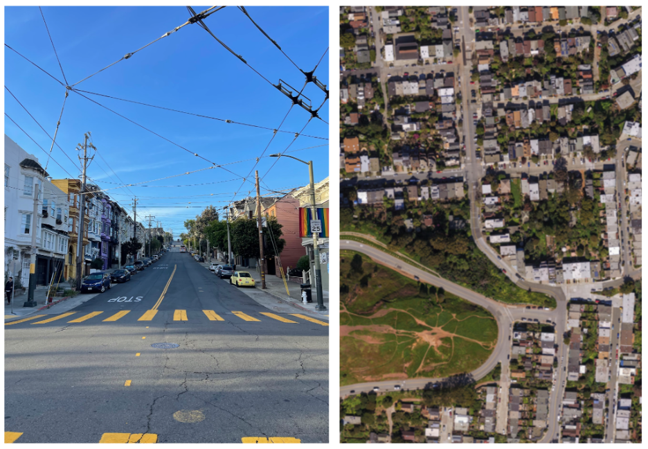
Figure 1: Photograph of crosswalks in San Francisco by the author (left), and aerial imagery of the city’s intersections, drawn from an image by Dan Koopman hosted on OpenAerialMap, licensed under CC-BY 4.0 (right).
To be clear, I don’t think “slow research” only refers to desk work. A huge part of my research has been out in the field, and in many ways, quite slow. For example, during the summer of 2020, I embarked on a different sort of project. For some time I had been hearing frustrations bubbling up among transit riders and transportation advocates around San Francisco, complaining specifically about cars legally parked in front of MUNI bus stops. I had also noted in my own neighborhood that the signage of certain stops was glaringly inadequate, at times not much more than faded paint on a telephone pole. I remember taking a picture of one such stop in Potrero Hill and replying to Bloomberg reporter Laura Bliss’s call on Twitter for examples of bad bus stops. I started to wonder: how many stops are blocked by legal on-street parking? What is the spatial distribution of bus-stop signs, by type and quality? Sitting in a COVID-transformed city, with indoor activities on hold and international travel cancelled, I decided to find out, by conducting what I eventually called a bus-stop “census”, meaning I walked to each of the roughly 3,000 stops that make up the SFMTA network.
This took decidedly more than 90 hours. Over what turned into an entire summer’s worth of field work, I wore through sneakers and applied what was almost assuredly a gallon of sunscreen, spending every weekday cataloging a different set of stops. The work became meditative and addictive; some days’ field collection pushed into the evening, as the fog descended on the city and visibility deteriorated. It felt a bit like a video game, or a Fitbit-like challenge, in that the higher my daily count of cataloged stops got, the more points I felt I earned. At the end of it, sunburned and weary, I sat on a comprehensive dataset of the city’s stops, the resulting study of which led the Board of Supervisors to unanimously pass a resolution calling for the elimination of parking in front of MUNI stops, setting the agency into action to do so.
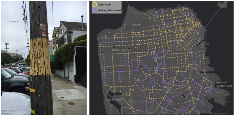
Figure 2: Photograph of a bus stop in San Francisco (left) and a map of approximately 3,000 bus stops visited by the author as part of the 2021 study (right). (Source: Author)
Slow methods of this kind, both in terms of combing through data, or plodding through city streets, has animated much of my research agenda. This has been true outside of San Francisco as well, such as when I visited every police station in New York City, or every pedestrianized street in Paris. In a world of readily-available data, open-access portals, repositories, and APIs, it is deeply satisfying to embark out into the urban world and build your own record of what you are investigating. There is no filter of or limit on what you can collect. Indeed, taking this time can lead to an unparalleled richness in observation – akin to what anthropologists call ‘thick description’ – which both serves the project at hand and generates a range of new ideas for future work.
At times, when describing such methods, I have been met with disbelief or disinterest in replicating such efforts elsewhere. This always leaves me thinking: “Is this not the job?” Immersing myself in the cities I aim to study, or the datasets I hope to visualize, is the joy of the profession for me. I see this approach as fruitful for research not despite its time-intensive nature, but because of it. When I am knee-deep in the material itself, physically or virtually, I am in no rush.
MARCEL MORAN is is assistant professor in the School of Planning, Policy, and Environmental Studies at San José State University. He studies urban transportation, including via in-person field collection, use of satellite imagery, and analysis of large open data sets. He earned his PhD from UC Berkeley's Department of City and Regional Planning, masters degree from the University of Chicago, and bachelors degree from Harvard University. He lives in San Francisco.